With the government gearing up for some major new digital health infrastructure projects the details of the Medical Cost Finder fail make for some sobering reflection.
The release recently of the gory details behind how monies were spent on the Medical Costs Finder project offers some sobering insights into just how wrong things can go.
While there appears to be much better planning in place for a series of major new digital health infrastructure investments which the federal government is planning to run and control – such as a national health information exchange – there are lessons to be learned.
We already know the top two lines of this massive fail: nearly $23 million spent to create a transparency site where the public could go and find comparative information on specialists fees, and so far, only 52 specialists have signed up to provide information, out of a potential of over 40,000 that could have, if there was any meaningful plan to get them to do so.
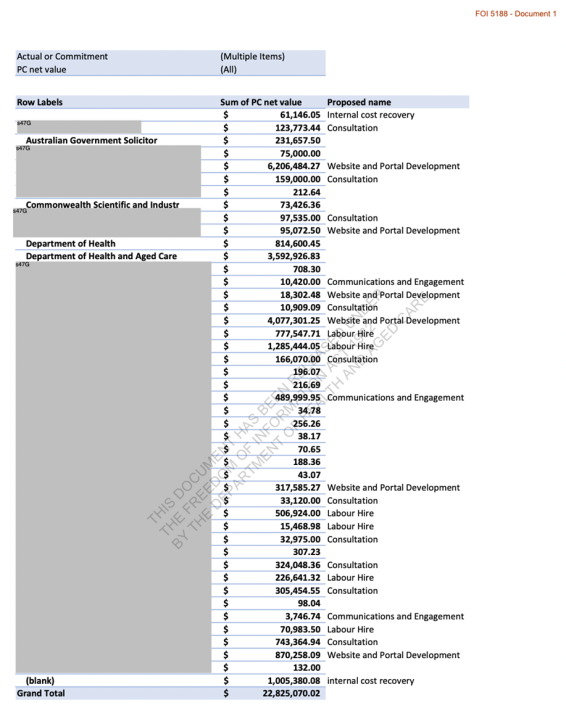
FOI 5188 (Document 1) provides us with a breakdown of how the $23 million was spent, and in the detail there is even more grief to be had in the failed project, and lessons for DoHAC and the Australian Digital Health Agency to heed.
We have published the whole spreadsheet for you below to make your own assessment of what went on, but here are some patterns we saw of the cost journey on the project which we think are interesting, and hard to explain:
- Nearly $7 million spent with the Australian government solicitor, most of it listed as website and portal development;
- $1.8 million on consultants (which are very hard to find now as being part of the project);
- $265,000 spent with the CSIRO trying to get them to help;
- $504,000 on communication and engagement which comes in at roughly $10,000 per specialist they ended up engaging in the idea;
- $1 million on “internal cost recovery” to DoHAC – a loose term, even for this project;
- $8 million on web development (including labour hire).
All for 52 specialists to sign up to the site, rendering the project entirely useless for the purpose it was intended and signalling that it will almost certainly never get levels of engagement that will make it useful.
You’d think that DoHAC might be considering mothballing the project based on ongoing hosting and maintenance costs but a quick search of tenders for the project reveals that as recently as 26 June the department tendered for $55,000 to create a series of videos about the site and $45,000 on a mailout in May.
We’d be remiss here not to mention the $11,462 the department spent on a tender for promotional merchandise, albeit that tender was back in July 2022.

Obviously, this project went wrong a long time before people started blithely spending a lot of the money listed above.
It was a bad idea.
But no one properly tested the idea, or at least the execution plan for the idea. Proof of concept is fundamental in any project spending this much money. Whoever did proof of concept, if anyone did, got it hopelessly wrong.
Rigorous POC testing early on could likely have been done for less than a few hundred thousand with the right consultant.
But even if we accept the most fundamental miss in product development protocol at the beginning of this project, once the project got going, some of the costs for what we ended up with simply don’t add up.
So the DoHAC got it wrong, and then amplified the mistake considerably.
We have some good software companies in digital health in Australia that are going to look at that $8 million in web development costs and the end product and shake their heads in disbelief – and envy for whoever got paid that much to do not much and fail.
Some of our most impactful local software vendors spent a fraction of that on the first iterations of what are now major software platforms serving our healthcare system.
Just one example is that both of our major GP patient management systems spent much less on their first few iterations of products which would have a major impact on our healthcare system. These systems now serve over 30,000 GPs and form the hub of millions of clinical and financial transactions per month between GPs and their patients across the country.
Just how DoHAC could have been overseeing this project and not understand that things were fundamentally out of whack in terms of the money spent to build one relatively simple concept website – a fee comparison portal – might be pointing to some fundamental shortfalls in the capability of the department to run and assess major digital health infrastructure projects.
One tender recently put out by the ADHA is to review the Agency’s internal capability to run and build major infrastructure projects.
What might be equally fascinating as the above FOI would be an FOI request to obtain a line-by-line spreadsheet of how we spent $7 million on the government solicitor on one, relatively small project.
We say relatively small because DoHAC, via the ADHA, has run projects well into the billions, along with Services Australia, where the spend on legal is large and often justified to overcome large privacy issues at scale.
It’s difficult to see how the knowledge understood already within the department from major projects like these was not leveraged in this project to keep this cost reasonable.
The other FOI request that would be enlightening here is the list of consultants who contributed to the project.
You can’t find them if you try to look backwards on the government’s main tender site.
Whoever is on that list were either incompetent in not pointing out fundamental issues in proof of concept, product design, and then development, or understood what they were doing and did it anyway.
Both scenarios are scary, especially if any of the consultants on this project are being considered for major new ventures currently on the government’s drawing board such as the national HIE.
We went looking for anyone who worked on the project and did find a Canberra-based UX group called CRE8IVE who did some work on the project. They apparently got involved at a point to redesign the entire site. Interestingly, before they got going they went and tried to check some of the fundamentals:
- Consulting with the MCF project team to identify main users of the MCF website and seek feedback on their needs;
- Assess and validate research participant feedback received from focus groups, surveys and a workshop report;
- Conduct a Moderated study with 20 participants from a specific demographic exploring real-life scenarios to action through the website.
Quite a few red flags here, the main one possibly being how many people they actually talked to in order to establish (or re-establish perhaps) whether there might be a fundamental flaw in the base concept.
In any case, this group didn’t identify any red flags for DoHAC and so the whole thing kept going.
It would be wrong however to lay much blame for the mess on a group like CREA8IVE.
Clearly a lot of the damage was done by the time this group came on board and like other major government project fails, political momentum can stymy any rational thinking when a project is obviously down the wrong track but no one wants to admit it.
It would be instructive for someone inside DoHAC to conduct a comprehensive review of what went wrong with this project and why, as it is such an enormous fail in relative terms.
In the same review the department should examine the more than $2 billion spent on the My Health Record (for very little return so far on its initial goals) because although one is a mega project and one relatively small in comparison, they both have similar problems.
Are there some themes and weaknesses the department needs to look at in their process on projects like these, especially in the concept and design phase?
The My Health Record, one could argue, had a serious proof of concept problem that was not addressed at the start. This was probably because it was a politically driven initiative from the get-go.
In fact, it had started out as a concept that was the opposite of what it became: it was originally meant to be a federated set of data repositories that could be polled from across the system, but morphed into the one central data repository to rule them all.
This was despite several key experts from within the ADHA tent at the time warning that the concept had become largely outdated technically by the time they started spending big money on it.
Related
Once the MHR got going, and wasn’t working, instead of facing some increasingly obvious truths, the government decided on a famous US military tactic. If it’s not happening, just double down on spend, effort and PR (which was Opt Out phase of the the My Health Record), and see if that works. Such was the political momentum the project had gathered.
DoHAC’s next big thing in terms of digital health infrastructure is the national HIE (strictly the project is being run by the ADHA but it’s being endorsed and overseen by key people in DoHAC).
In some respects, proof of concept has been partly done by other countries for this major new project. The US operates a distributed data repository search and find model for real time meaningful health data information exchange, as do regions in other countries such as the UK and Canada.
But that doesn’t mean we can’t get it wrong in a big way like we did the My Health Record.
The next stages of the HIE project are the most important and everyone needs to be watching carefully and contributing where they can.
While distributed search does work in overseas countries, Australia needs to very careful to prove its use cases, for providers and patients, and then be very sure (test a lot early) that whatever they intend to build will end up being useful to providers and patients in a manner that will get them to engage at scale with whatever is built.
This didn’t ever happen with the My Health Record.


