
It seems GPs are quietly quitting, but good luck finding the data on that. Louise Stone has a crack.
In the last few weeks, and it has been only a few weeks, I’ve been conducting a survey about women GPs who are retiring or planning to retire within five years, and also the women GPs who have or will reduce their hours in clinical general practice by at least 50%.
The response has been staggering. So far, we have 930 responses and 50,000 words of free text, unheard of for a survey. It has made me think.
In the last few years, I’ve become a bit of a data geek. It was supposedly Mark Twain who said “if you torture the data long enough it will confess to anything” and I must say I have realised that “evidence-based” policy is swung by narratives, usually composed of graphs, that tell a story. What I always find interesting is what I CAN’T find in the data.
The Australian Institute of Health and Welfare and the Australian Bureau of Statistics have, in recent years, taken the approach that community data belongs to the community. They have therefore developed portals where anyone can download and (mis)interpret numbers. I live with an Excel geek, so I also have the capacity to whip up a graph really fast using a variety of techniques, and I’ve realised how powerful a graph can be.
A graph gives an illusion of objectivity. It represents “proper” information with “valid” assumptions that are “evidence based”.
However, we all know that we choose a line graph or a bar graph or even a pie graph because it emphasises a story we wish to tell, and that “objective” evidence is always influenced by the assumptions underneath the numbers which, to their credit, the AIHW and ABS carefully explain.
Which brings me back to workforce.
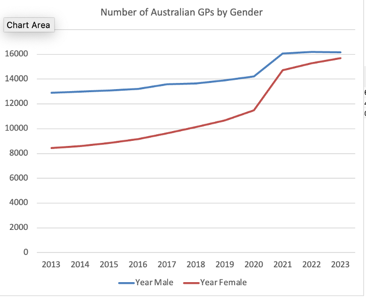
One of the things that is almost impossible to find is an accurate representation of what is happening to GPs. I can find how many GPs there are, and what the full-time equivalent is, by gender, represented below. However, cross-sectional data like this doesn’t tell me how much the pipe is leaking. It tells me how much water is gushing out the end, but not how much is lost.
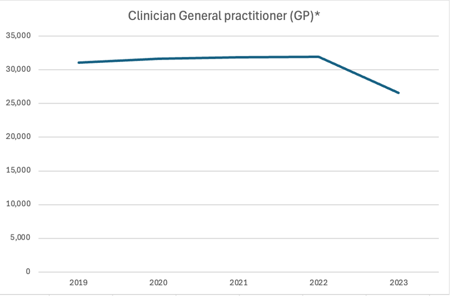
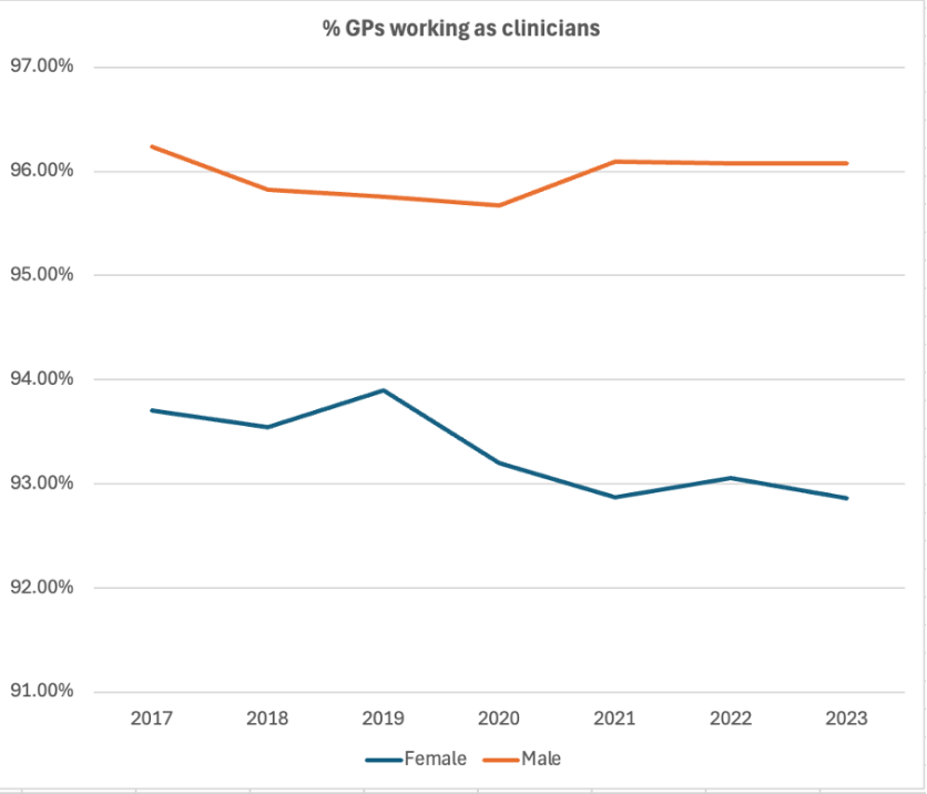
Here’s the graph based on the Health Workforce Data Tool which shows how many GPs say they are “clinicians”. There are so many questions around what this actually means.
Whatever it means, I can see that women seem to be leaving clinical practice.
That’s all very well, but what are they all doing?
I can find how many clinical hours GPs say they do from the AHPRA survey, but again, think about how you decide what to write on that survey.
Related


I lost a lot of confidence in it when I realised most people guesstimate their hours in lots of 10. I am absolutely sure few of us work exactly 40 hours, or 50 hours or 60 hours, but when nobody writes 61 or 42, I think there is a degree of error. I completely lost confidence when one year, GP clinical hours exceeded total hours, which indicates to me that GPs felt like their clinical work was endless.
What I don’t know is this. How many practices are closing? No idea.
How many GPs have moved out of general practice, and into other more specialised roles? I can hazard a guess but I’m not sure how accurate it is. After all, would I call “urgent care clinic” work community work or other work? No idea. I don’t know how many GPs are retiring.
I can’t pull apart the MBS data by gender either.
I suspect all this data exists, but is not publicly available. Surely someone, somewhere knows how many GPs are leaving and how many practices are closing, but this is obviously not a story anyone really wants to tell. After all, whether unintended or not, the cost of “strengthening Medicare” and “unleashing the power of the health workforce” seems to be the loss of many of the most effective and efficient health professionals in the network.
For every physio who is now empowered to work independently, for every nurse practitioner who can now set up their own business and every pharmacist who can inject drugs, it seems there are GPs who are quietly quitting, unable to sustain a career financially or emotionally that focuses on the people nobody else wants to see.
So, if you want to add your voice to this survey, (I say with shameless spruiking of the research) please do. I promise I will tell the story to the best of my ability. Because at the moment, I can’t see it being told through the official data, and I suspect it is because it doesn’t fit with the preferred narratives of our day.
And thank you to the RACGP, who generously gave me a Wellbeing grant to get this off the ground. With Karen Price, Michelle Barrett, Megan Cahill and Erin Walsh, we are doing our best to do this narrative justice.
Join us at www.timetogo.com.au to see more.
Associate Professor Louise Stone is a working GP who researches the social foundations of medicine in the ANU Medical School. She tweets @GPswampwarrior.
